New look & digital platform for 3DReid
The team at 3DReid approached us to help them overhaul their digital presence and in doing so help evolve their brand to better capture their story.
Through our workshop sessions we discovered that they had a reputation for delivering buildings and spaces that work, putting the end user central in their decision making. What wasn’t been captured was the design credibility within their work, beautiful and inspiring as well as practical.
We evolved their logotype to a simple yet elegant sans and replaced their existing corporate palette with a more expressive, natural one designed to work alongside their stunning project photography. We also introduced a serif to their brand toolkit to better reflect their mix of modern and heritage projects in their portfolio.
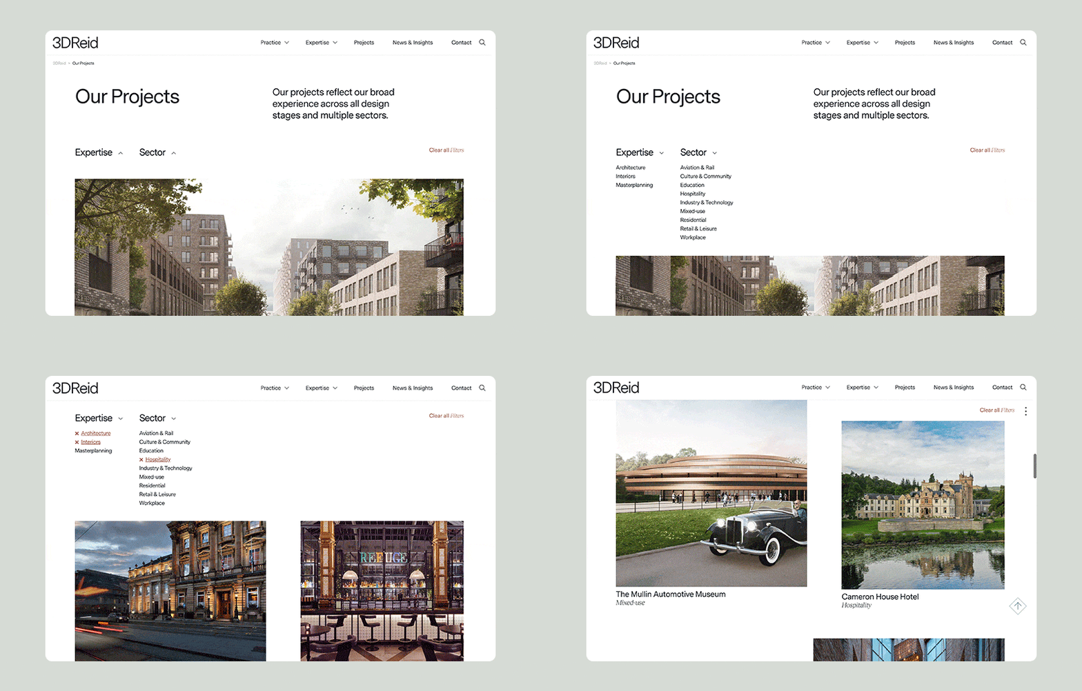
The brief for the website itself was to give them a flexible showcase for their work and a home to celebrate their amazing team. Another key consideration was making sure that all their expertise; architecture, interiors and master planning be given equal billing within the site architecture.
Hindered by the design of their old site they weren’t able to have the level of desired flexibility within their project pages. We developed a component based approach that allowed them to focus on the unique aspects of each job and create a page perfectly tailored to its story whatever the discipline. We also developed a detailed filtering system allowing them to share specific expertise within individual sectors with clients.
Perhaps the most important update was making the website into a much more human experience, celebrating their team and company culture through imagery and a more engaging news and insights area.
The end result is a site that captures who 3DReid are and what they stand for and with new users up by 32% and average time spent on the site up by 70% it’s definitely making an impact!
Take a look at the new 3DReid Website.

- Share:


