The Otto

Celebrating flora & fauna on Hackney Downs

Project Information
The Otto | Brochure Design | Steve Edge Design

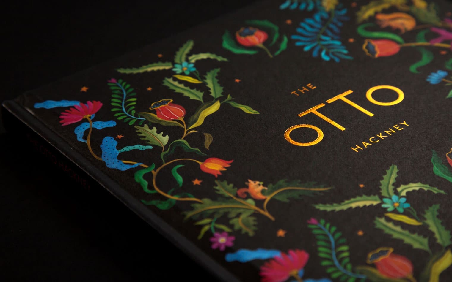
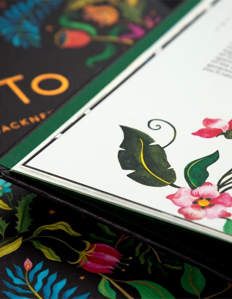
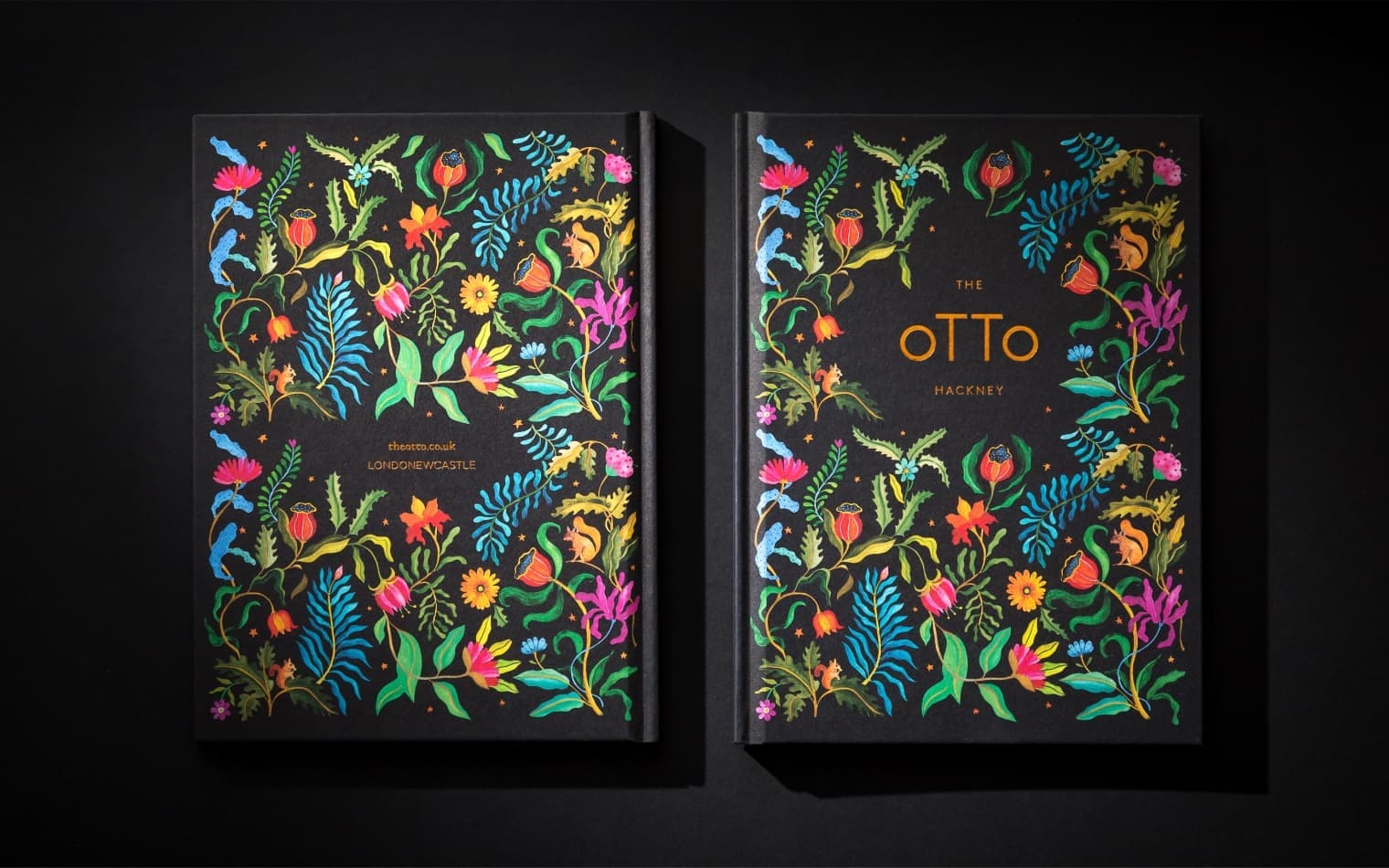
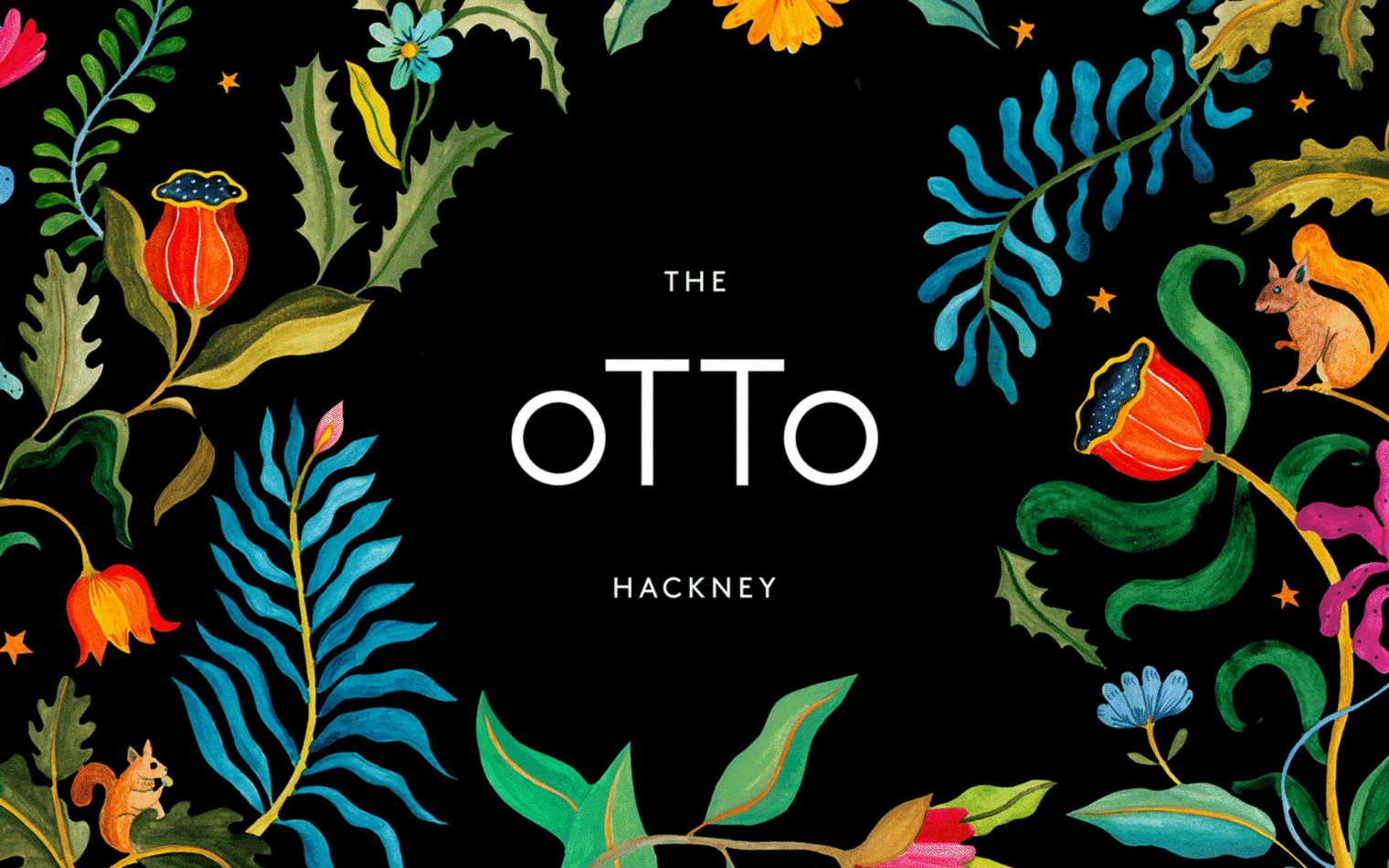
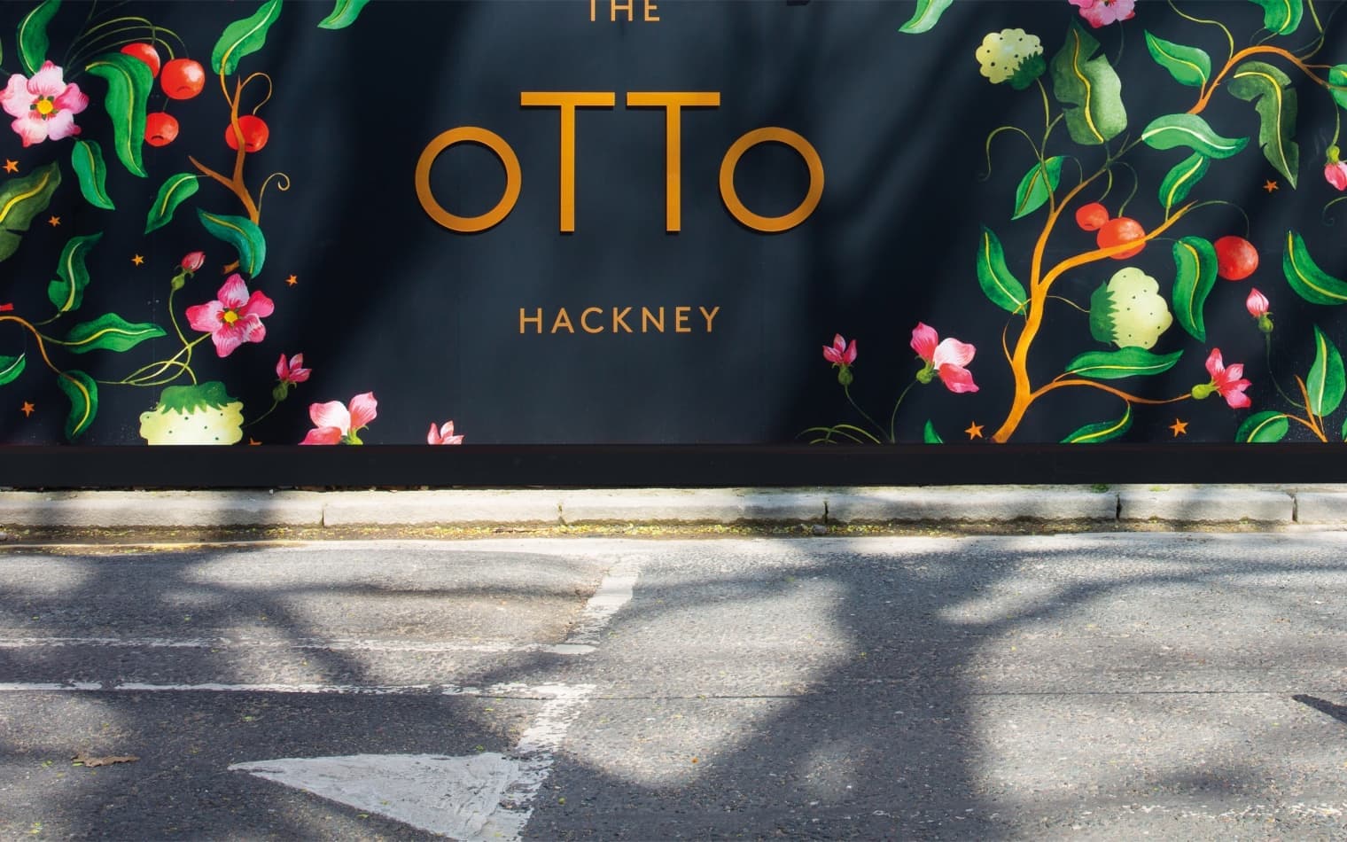
Persian in origin, the name ‘otto’ means the ‘fragrance and essential oils derived from plants.’ We commissioned an illustrator to develop this sentiment in a series of bespoke, floral patterns inspired by the natural life on Hackney Downs.

The Otto | Brochure Design | Steve Edge Design
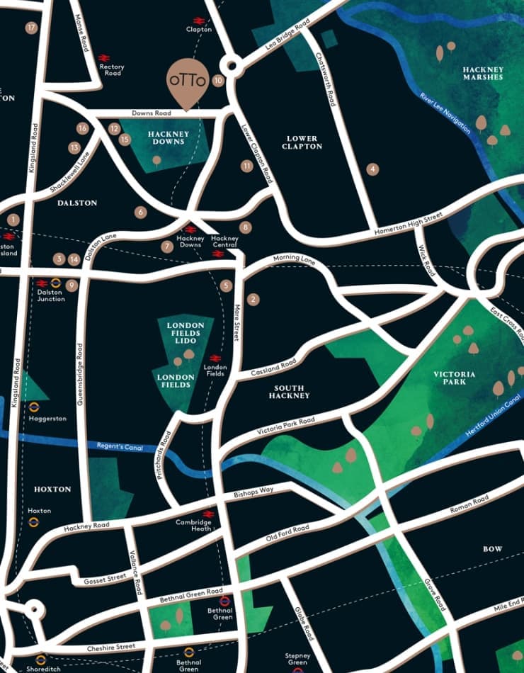
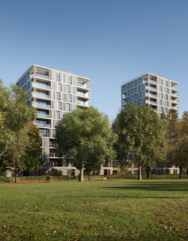
The Otto | Property Branding | Real Estate Branding | Steve Edge Design
The Otto | Signage Design | Steve Edge Design

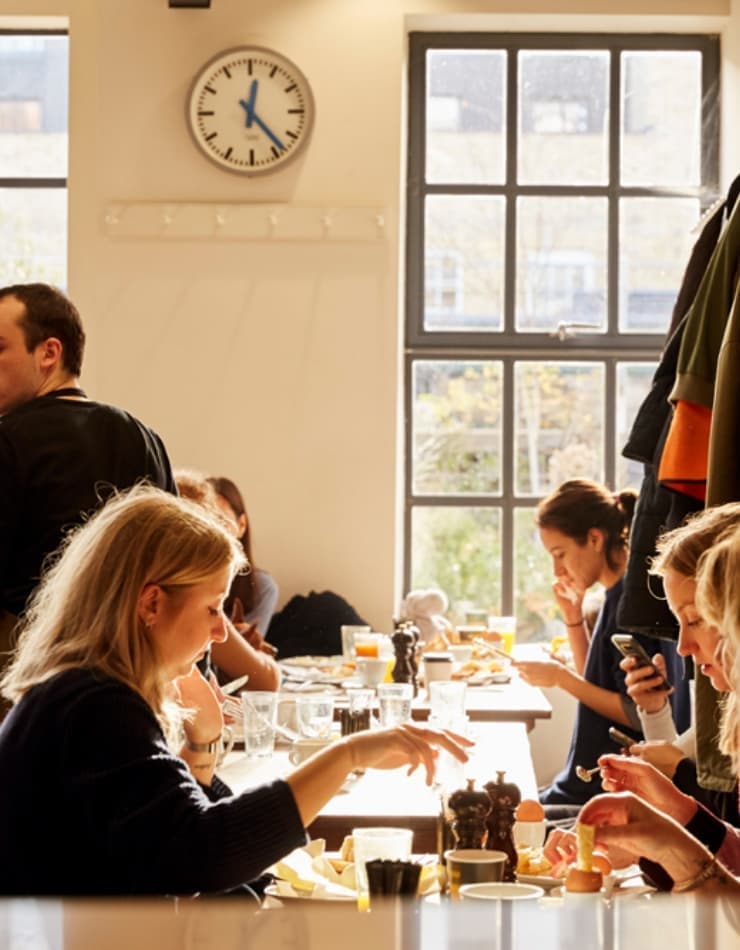
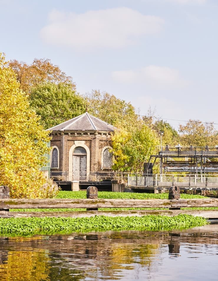
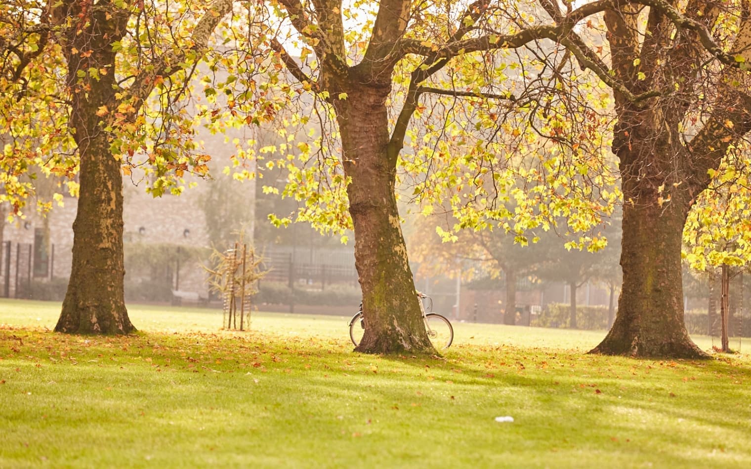
Photographer Emli Bendixon captured the warmth and energy of both the Downs and the local neighbourhood.

The Otto | Property Branding | Real Estate Branding | Steve Edge Design

We rolled the brand out across all applications, bringing the website to life with colour, animation and plenty of movement and interactivity.

The Otto | Property Branding | Real Estate Branding | Steve Edge Design

Share

Previous

Invesco

Next

HIBio
Get in Touch

Get in touch by sending us an , giving us a call or completing our form …